Could you have predicted 10 years ago that a device smaller than your wallet would become something you couldn’t live without? And yet, would you want to try living without your cell phone?
A decade ago cell phones were used a lot like their landline counterparts—as voice-only devices. They were handy, but for most users weren’t vital to daily life. Most consumers were unaware that smartphones, with personal computer-like functionality and internet access, were just over the horizon. Today, it seems possible that mobile phones may overtake laptop and desktop computers as the center of our communications universe. In regions such as India, many consumers are heading straight to mobile phones and bypassing the expense or limited accessibility of PCs. Using mobile phones, consumers worldwide are able to accomplish as much as yesterday’s limited options for accessing the web or indulging in digital activities and games.

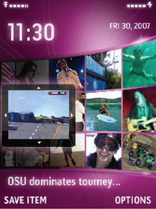
IN THIS HOME-SCREEN VIEW OF A “MEDIA WALL” EXPERIENCE, THE CLOCK’S LARGE NUMERALS ARE COMPACT, YET THE OPENNESS OF FIGURES LIKE THE 0 AND THE 3 ENSURE QUICK READABILITY.
A SMALL TYPOGRAPHIC REVOLUTION
While the capabilities of the cell phone have advanced quickly, an important ingredient—type—has lagged behind. Type underlies many of the impressive features of today’s mobile phones. If you can’t maneuver the user interface because of poor readability, or if the game or application isn’t memorable, fun or user-friendly, type might be the culprit. It’s surely one of the most important ingredients for instilling the right personality or tone in anything that displays text, mobile phones not excepted.
Fortunately, attention is now being placed on typography for the small screen, spurred by the demands of more media-centric phones embracing scalable, TrueType and sophisticated rendering technologies. And creative agencies that develop marketing campaigns and branding programs are no longer limiting their focus to traditional media. Design firms that specifically serve the mobile industry are also flourishing, including 5-year-old Punchcut, based in San Francisco. According to company cofounder Jared Benson, Punchcut provides user interface strategy, design and development services and works with handset manufacturers, operators, publishers and major entertainment brands to envision and create next-generation mobile interfaces.
“Typography for mobile phones is getting better as designers are getting more involved,” says Benson. “For years, application engineers were responsible for most of the fonts seen on mobile devices. In some cases, PC fonts were ported to the mobile phone without making needed adjustments that would help those fonts display and perform better on the new medium. Typeface design should really be handled by typeface designers who know how to bring proper nuance to characters while maintaining sensitivity to the forms themselves.”

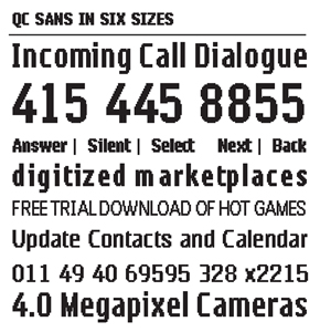
PUNCHCUT CREATED THIS BITMAP VERSION OF QC SANS FOR COMMON LOW RES QCIF SCREENS. IT REQUIRED METICULOUS CRAFTING OF EACH WEIGHT AND SIZE, 12 IN ALL, TO ENSURE MAXIMUM VISUAL COMPATIBILITY ACROSS THE FAMILY BY RETAINING KEY TRAITS WITH A LIMITED NUMBER OF PIXELS. THE RESULT IS A COHESIVE BODY OF FONTS THAT PROVIDES FLEXIBILITY IN A BITMAP THAT RIVALS MOST OUTLINE FONTS IN THE MEDIUM.
RESPECTING MOBILITY
What should a designer think about when approaching mobile type projects? According to Benson, good mobile design involves a deep understanding and respect for mobile phones and their integral position within today’s lifestyles.
“Designers have to be aware that ‘mobile’ refers to not just a device but a way of life. Ultimately, part of the designer’s obligation is to help clients engage or empower mobile end users. The designer can play a big role in enhancing the mobile experience.”
The word “mobile” provides a key clue in approaching typeface design for the small screen.
“People are on the move. If I’m dialing or trying to find a friend in my phone’s address book while driving or walking in a crowded area, my attention span is limited. I need to achieve this via short glances at the phone in my hand, which is probably held at an arm’s distance. Character recognition, therefore, is especially important.”
Understanding design goals is critical. Bensons advises challenging yourself with core questions.
“Is the font seeking to differentiate? Build a brand message? Create better interface clarity? Take advantage of a new rendering technology?”
Designers must also understand target devices and their technical specifications:
“If possible, get your hands on the device so you can test directly on it.”
Embrace research.
“Look at what the competitors are doing. Crawl the web for data.”
If budget permits, user research can provide insights to shape the design.
“Create a project plan that allows for testing at every step of the design process. Investigate size, contrast and subtle design changes. What visual attributes will be seen across your character sets? Don’t fall into the common trap of burdening a few characters of the font with all the personality of the face. Prepare several design options to present to your client. Be prepared to present reasons why they are effective for the client’s business goals. Prepare some key words set in the different design options.”
Once a design style has been chosen, designers should be ready to explore the full character set and be prepared to show how the entire family fits together.
“How does the font change when the bold is used? If you’re creating a bitmap family, what design details are seen across all the varying sizes you will have to create?”
With approval on the core alphabet in roman and bold, development of the remainder of the character set and the heavy production begins.
CRITICAL DESIGN TRAITS
Benson rates the following traits most important for success in designing type for the mobile environment:
- Compact width for economy of space
- Legible characters and a generous x-height to ensure readability
- Ability to scale the type to varying sizes, maximizing versatility
- Utilitarian design with longevity
- Good solutions for emphasis and creating hierarchy
Benson cautions that easy “solutions” like switching from regular to bold type may do little more than create new problems. “Naturally, the bold fonts are wider due to heavier vertical strokes. This can lead to display problems if introduced in the wrong place. Because of this, the mobile industry has been rather selective about switching between roman and bold fonts.” In the case of one Punchcut client, he says, that represented an opportunity. “The typeface we created for Qualcomm was able to solve this effectively, opening up new ways of emphasis for the mobile developer.”

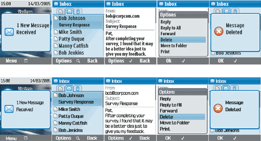
THESE MOCKUPS SERVED AS THE CONTROL AND TEST FONTS FOR THE USER STUDY CONDUCTED DURING THE DESIGN PROCESS FOR QUALCOMM.
FUTURE PHONES
How will mobile phones perform 10 years from now? Will they wake us up in the morning and inject us with euphoric feelings, readying us to start a new day and accomplish great things? One can only hope not. Will mobile phones be even smaller than they are today? This also seems unlikely, as our fat fingers would rebel. Yet with companies like Punchcut, designers like Jared Benson, and others with the same passion to improve how we communicate, the type is sure to look good.
CASE HISTORY: QUALCOMM
As part of designing a user interface typeface for Qualcomm, Punchcut was asked to design a custom family of sans serif fonts to be used in Qualcomm mobile interfaces. The project’s scope was to assess, design and produce a custom family of fonts for use in Qualcomm’s Brew solution on standard (low resolution) and QVGA (Quarter Video Graphic Array or high resolution) mobile phones.
Until this project, Qualcomm had used converted bitmap font families originally designed for computer- or print-based environments. “They understood that font usage issues were becoming more critical in delivering an effective and appealing user experience,” says Benson. “Mobile data services were becoming more popular, thanks to the impending arrival of 3G [third-generation] phones designed to accommodate these services.”
The expectation was that a well-designed and engineered suite of scalable fonts would appeal to Qualcomm customers, including its developers, OEMs and mobile service carriers. In turn, these customers would benefit with increased flexibility and the potential to create and deploy unique, customized user experiences faster and easier.
CHALLENGE AND EXECUTION
The challenge for Punchcut was to design a typeface that succeeded not by drawing attention to itself but by supporting other elements of the user interface. “In mobile interface design, typography should be the invisible workhorse,” says Benson. “As a whole, typography for the phone is about balancing the elements to provide a clear, effective communication medium that doesn’t upstage the messages being communicated.”
Punchcut presented a variety of stylistic designs. Each specimen included macro and micro views of individual characters, words or sample usage examples. These stylistic explorations were uploaded to a testing device and reviewed with Qualcomm for feedback.
Ultimately, the final design decision involved the use of traditional forms and squared-off counter shapes—deemed the most appropriately engineered forms for increasing readability. “In this case, functionality, rather than subjective aesthetics, drove decisions during the design process,” Benson explains. Punchcut designed each weight with consideration given to how text would be used, whether dialing, navigating a text list or reading a text message. “It’s important to keep the characters distinct from one another, and research has shown that wider letterspacing in small sizes significantly aids reading from the screen,” says Benson.
Today, the resulting fonts, known as the QC Sans and QC Sans Bold designs, are available to Brew licensees. Monotype Imaging handled the conversion of Punchcut’s designs from bitmaps to TrueType-based, scalable fonts. Other text-based technologies available through Brew include Monotype’s iType scalable font engine and WorldType Layout Engine, a software library for composing, positioning and rendering multilingual text.
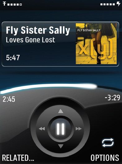
(TOP): MUCH MORE RICHNESS CAN BE BROUGHT TO THE MUSIC EXPERIENCE WITH IMAGERY, COLOR—AND OF COURSE RICHER TYPOGRAPHY—AS PEOPLE UPGRADE THEIR MONOCHROME IPODS OR LOW RES HANDSETS. THIS MEDIA PLAYER BENEFITS FROM A CLEAR, AT-A-GLANCE INDICATION OF THE ARTIST, TRACK INFORMATION AND STATE OF THE PLAYBACK.
