My first design job was with a small print design agency in Manchester that produced work in varying media: packaging, publications, and marketing support materials, and…direct mail. I soon discovered that the graphic design principles I’d learned in college were of little use when I designed for direct mail, where big, bold, and crowded is the order of the day. In the words of one client—words I will never forget—“whitespace is empty space.”
Direct-mail clients need their packages to look down-market, because it works for them. But for just about everything else, my client couldn’t have been further from the truth.
Meet whitespace
“Whitespace,” or “negative space” is the space between elements in a composition. More specifically, the space between major elements in a composition is “macro whitespace.” Micro whitespace, is—yes, you’ve guessed it—the space between smaller elements: between list items, between a caption and an image, or between words and letters. The itty-bitty stuff.

Figure 1. Macro whitespace
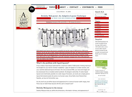
Figure 2. Micro whitespace
So what does whitespace do?
Micro whitespace and legibility
A couple of months ago, I was lucky enough to see Erik Spiekermann give a lecture. Part of his talk addressed his redesign of The Economist newspaper, which was partly motivated by the client’s realization that their design was too heavy and the content too difficult to read.
In newspaper design, information is dense. Sometimes, as in web design, it’s difficult to add whitespace because of content requirements. Newspapers often deal with this by setting their body content in a light typeface with plenty of whitespace within and around the characters. This was part of Spiekermann’s solution for the redesign of The Economist.
Whilst retaining the quirkiness of the original Economist typeface, Spiekermann redesigned it slightly, adding more whitespace to the individual characters. He then set the type slightly smaller and with more leading. All these changes added micro whitespace to the design. The overall result was subtle: the content was more legible and the overall feeling of the newspaper was lighter, yet the amount of content remained the same.
Though Spiekermann also added macro whitespace and color to The Economist his successful type redesign demonstrates that the space between the itty-bitty stuff can have a big impact on the effectiveness of a design—and this applies to design for the web as well.
Brand positioning
Designers use whitespace to create a feeling of sophistication and elegance for upscale brands. Coupled with a sensitive use of typography and photography, generous whitespace is seen all over luxury markets. Cosmetics, for example, use extensive whitespace in their marketing material to tell the reader that they are sophisticated, high quality, and generally expensive.
My old direct-mail client was correct in his assessment of whitespace for his particular product, because direct-mail packages need to appear down-market to work—and adding whitespace to his design would have lent his package an undesirably upscale quality. Take the following example.

Figure 3. Examples of direct mail vs. luxury brand design
The content is the same on both designs, as are the other elements, such as photography. Yet the two designs stand at opposite ends of the brand spectrum. Less whitespace = cheap; more whitespace = luxury.
A lot more goes into brand positioning than just whitespace, but as a brief lands on your desk for a luxury brand, it’s very likely that the client—and their target audience—expects whitespace and plenty of it to align the product with its competitors.
ACTIVE AND PASSIVE WHITESPACE
Whitespace is often used to create a balanced, harmonious layout. One that just “feels” right. It can also take the reader on a journey through the design in the same way a photographer leaves “looking room” in a portrait shot by positioning the subject off the center of the frame and having them looking into the remaining space. When whitespace is used to lead a reader from one element to another, it’s called “active whitespace.”
Let’s take the following example before any active whitespace is applied:

Figure 4. Text before whitespace is added
Everything is pretty cramped. We need to add whitespace to create harmony and visual comfort in the design. First, I add margins, change the type family and weight, and also increase the leading (or line-height, as it’s known in CSS). This is all “passive whitespace.”

Figure 5. Text with passive whitespace added
Some might argue that passive whitespace is the unconsidered space present within a composition. I disagree: if you don’t consider all your whitespace, that’s just bad design. Passive whitespace creates breathing room and balance. It’s important.
We’re not done yet, though. Within this content is something that I want the reader to pay extra attention to: the second quote. I could highlight this element with a different color or make the type size larger, but in this instance, I’ve simply added macro whitespace around the element to draw the user’s eye, then reduced the micro whitespace within the type by making it bold.

Figure 6. After active whitespace has been added
This is active whitespace—whitespace added to a composition to better emphasize or structure, information.
Practice, practice, practice
The only way to come to grips with a concept as subjective as whitespace is to practice. In the same way martial artists have to spend hours upon hours drilling simple techniques, graphic designers have to do the same. Compositional exercises have been conducted by graphic design students for decades and, luckily for us, some of the design legends of past years have documented the process. Emil Ruder is one of my favorites.
Ruder was a Swiss typographer who died in 1970. After 21 years of teaching typography, he produced a book called Typography: A Design Manual, in which he states:
“The book is deliberately restricted to pure typography, to working with prefabricated types which are subordinated to a precise system of measurements. Its purpose is to make apparent the laws of typography and—in spite of certain common features—the contrast between it and graphic design which in both the selection and means of their application, is freer and more complex.”
Ruder’s teachings are fairly black and white, with a focus on typography and the subtlety of designing with letterforms. Ruder takes you through the rights and wrongs, which is a great place to start learning the fundamental principles of composition. The book is chock-a-block with great exercises covering whitespace and other compositional devices. It’s expensive, but well worth the price.
Once you know how to design and manipulate the space outside, inside, and around your content, you’ll be able to give your readers a head start, position products more precisely, and perhaps even begin to see your own content in a new light.
